UX/UI Guidelines
Table of contents
General page template
Data grid
Dialog
💡 Use the Dialog component instead of a modal. The modal is the low-level element meant to block the interaction. The Dialog is based on a modal, but specializes in providing information and further actions.
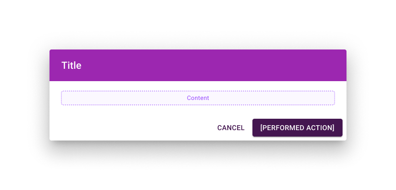
A Dialog is composed of three main parts:
-
Title. Contain a brief, clear statement or question. It should communicate the Dialog’s purpose.
Background color is
secondary. -
Content. Anything needed for the context, from supporting text to full-size form.
With long content, use the
scroll=paper. -
Actions. There’s always a way to go back (Cancel). And the main action is on the right. The label should reflect the action performed when clicked.
If any required field is in the content, the action button is disabled until they are completed.
Cancel. Text button, primary color.
Action. Contained button, primary color.
Responsiveness is configured as follow:
> 🚧 TBD (full-width + variable maxWidth depending on breakpoints?).
Icons
Material Icons should be in the Outlined style by default.
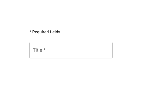
Required fields
When information is required to proceed:
- Required field(s) should show an asterisk
*after the label. -
Above required field(s), explain what the asterisk does. This message is displayed once, after any title and before required field(s).
Add
* Required fields., with the typography stylesubtitle2. - The action button below the field(s) is enabled only when all required fields are completed.
Theme
Main colors
- You can find matching primary and secondary colors using a palette generator like Coolors. If you already have a primary color in mind, you can also generate a matching secondary color with a Color Wheel.
Generate MUI color variants for theme.json
-
Use the MUI Theme Creator. On the bottom-right you can edit a
maincolor to automatically generate itslightanddarkvariants, and the correspondingcontrastTextcolor.Note those are different from a light/dark app theme. They are a lighter and darker shade of the main color. You can use them to play with contrast in the interface.
Check contrast
- It’s a good practice to check contrast. Online palette and color tools tend to rely on varying contrast standards. Better to double check and choose which contrast standard you want to aim for.
-
MUI uses colors in different contexts. To prevent any issue, try your colors’ contrasts accordingly. Check primary and secondary as text for both white and black background.
Note that you don’t necessarily need your colors to have a good contrast with white and black out-of-the-box. This is to make sure light and dark mode will work. But colors can also be further adjusted to better work in a specific mode.
- It’s good to have some contrast between primary and secondary. You don’t need a standard-level contrast. But a secondary component on a primary background can be a thing (like a badge with number of notifications). If primary and secondary are too close, the interface will become less clear.
Generate appbar-chip-inactive colors
- If your primary color is darker than your secondary. Use
secondary darkasappbar-chip-inactive mainand Generate MUI color variants from it. - If your primary color is lighter than your secondary. Use
secondary lightasappbar-chip-inactive mainand Generate MUI color variants from it.